Plotting from a meta file
Here we will go through step by step how to generate plots directly from the pesummary meta file. This tutorial will utilize the plotting methods in the pesummary.utils.samples_dict.SamplesDict class and the pesummary.utils.samples_dict.MultiAnalysisSamplesDict class. Firstly, let us make a meta file.
>>> from pesummary.io import write
>>> import numpy as np
>>> parameters = ["a", "b", "c", "d"]
>>> samples = np.array([np.random.normal(10, np.random.random(), 1000) for _ in range(len(parameters))]).T
>>> write(parameters, samples, outdir="./", label="one", filename="example.h5", file_format="pesummary")
Now, lets make several plots showing the data. The list of available plots can be displayed by running:
>>> from pesummary.io import read
>>> f = read("example.h5")
>>> samples = f.samples_dict
>>> type(samples)
<class 'pesummary.utils.samples_dict.MultiAnalysisSamplesDict'>
>>> samples.available_plots
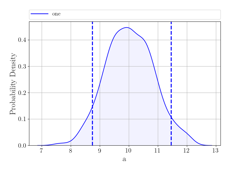
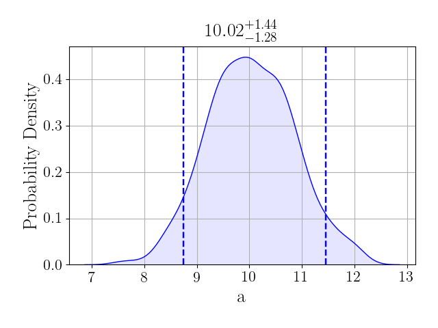
Now, lets make a histogram showing the posterior distribution for a:
>>> fig = samples.plot("a", type="hist", kde=True)
>>> fig.show()
Alternatively, if you prefer to see this displayed as a violin plot,
>>> fig = samples.plot("a", type="violin", palette="colorblind", latex_labels={"a": "a"})
>>> fig.show()
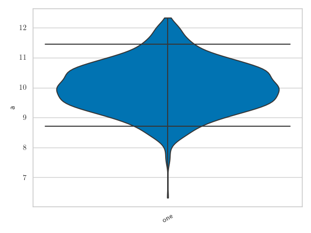
To see how the prior can also be added to this plot see Violin plots
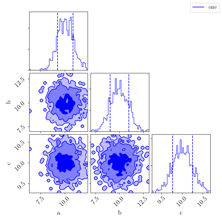
Alternatively, a corner plot can be generated for a subset of parameters:
>>> fig = samples.plot(type="corner", parameters=["a", "b", "c"])
>>> fig.show()
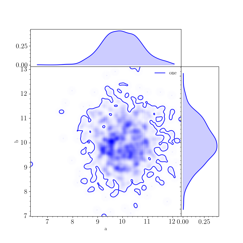
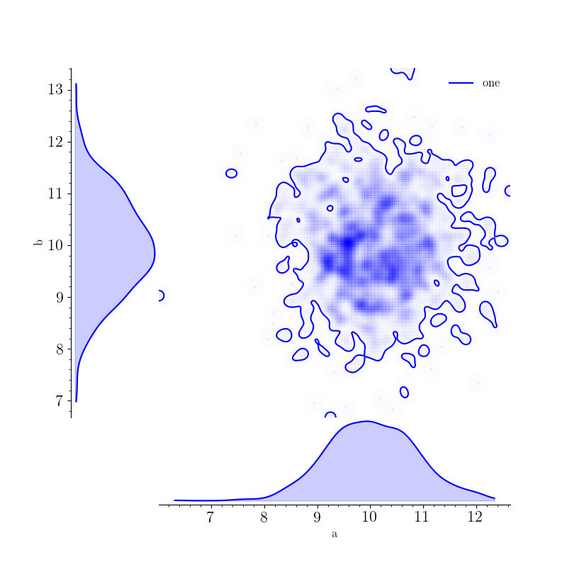
A triangle plot showing the posterior distributions for a and b can also be generated with:
>>> fig, _, _, _ = samples.plot(["a", "b"], type="triangle", smooth=4, fill_alpha=0.2)
>>> fig.show()
Or the reverse triangle plot for a and b can be generated with:
>>> fig, _, _, _ = samples.plot(["a", "b"], type="reverse_triangle", smooth=4, fill_alpha=0.2)
>>> fig.show()
All of these plots are generated with the MultiAnalysisSamplesDict class. Of course, the SamplesDict class can also be used for plotting:
>>> one = samples["one"]
>>> fig = one.plot("a", type="hist", kde=True)
>>> fig.show()
Which shows additional information.